How Apple can improve iPhone scrolling
I want to mention a UI issue I have with the iPhone OS implementation of scroll indicators, the unobtrusive bars that appear on the right side of the screen when scrolling through a list.
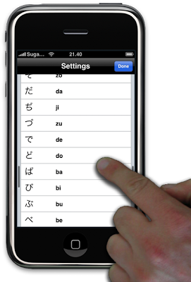
My hand obscures the scroll indicator
Like most people, I tend to use my right hand to interact with the iPhone. This means that my hand obscures a large part of the extreme right of the display, making it hard to see how far down the list I have travelled.
Proposed UI enhancement
My proposal is to have the scroll indicators appear on both sides of the screen.
The effect is illustrated in the photoshopped screenshot below, based on the settings screen in my Hiragana application.
Note how the scroll indicator appears on both the left and right sides
Is this really a problem?
This issue tends to bother me the most while reading longer articles at RoughlyDrafted Magazine or Daring Fireball. I often want to quickly check how far I have to go, in order to decide if I have time to finish the article or if I should save it for later.
In these cases the scroll indicator tends to be pretty small and a fair distance down the screen, right where I am least likely to easily see it.
What about panning?
Mobile Safari, and other applications that allow you to pan around a larger view in two dimensions use a horizontal scroll indicator in the lower part of the screen. This can can also be partly obscured by your hand, and should thus be supplemented by a scroll indicator across the top of the screen.
Speculation on the scroll indicator's background
I suppose Apple's decision to limit the scroll indicators to the right and bottom of the screen is based on how scrolling works in the classic desktop applications where scroll bars remain on screen whether in use or not.
To minimize wasted screen real estate and avoid UI clutter, it makes sense in a desktop application to chose a single place to present the scroll bar. The standard seems to always have been to place it on the right, and along the bottom for horizontal scrolling.
However on the iPhone scrolling works differently. There is no screen real estate wasted by showing the indicators on both sides since they are only visible while you are scrolling.
The appeal
So Apple, please add support for dual scroll indicators. It just makes sense.

